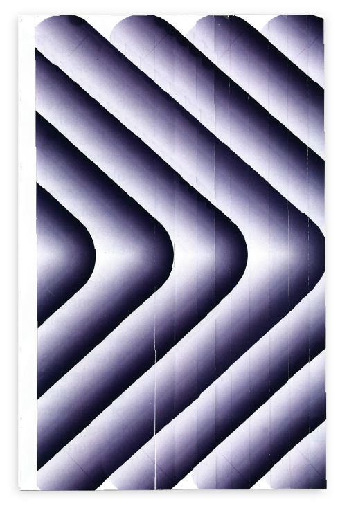
Planets
edotorial design︎graphic desgin
This 'Hybrid
Publication' was a project in which I designed a printed and digital
publication. Using stories of 'Invisible Planets' by Hoa Jingfang. The stories
are about how she travels 11 planets and learns about the inhabitants. How they
looked, behaved and developed, where and how they lived and what they ate.
This publication is
made in honour of the inhabitants that gave her a warm welcome to their planet.
The inhabitants who showed her the best fruits, the most beautiful flowers but
most of all the ones who gave her a glance of how these creatures live.
Each chapter is designed in the way inhabitants behaved, lived or developed.
Purple
is a mix between red and blue. Purple then also represents the relaxed vibe
from blue and the energetics from red. The purple used represents the galaxy
that connects the planets with each other. It's sign of neutrality and how the
planets are treated in this book with the same dignity.

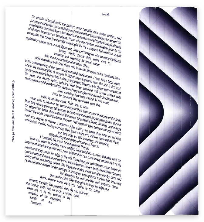
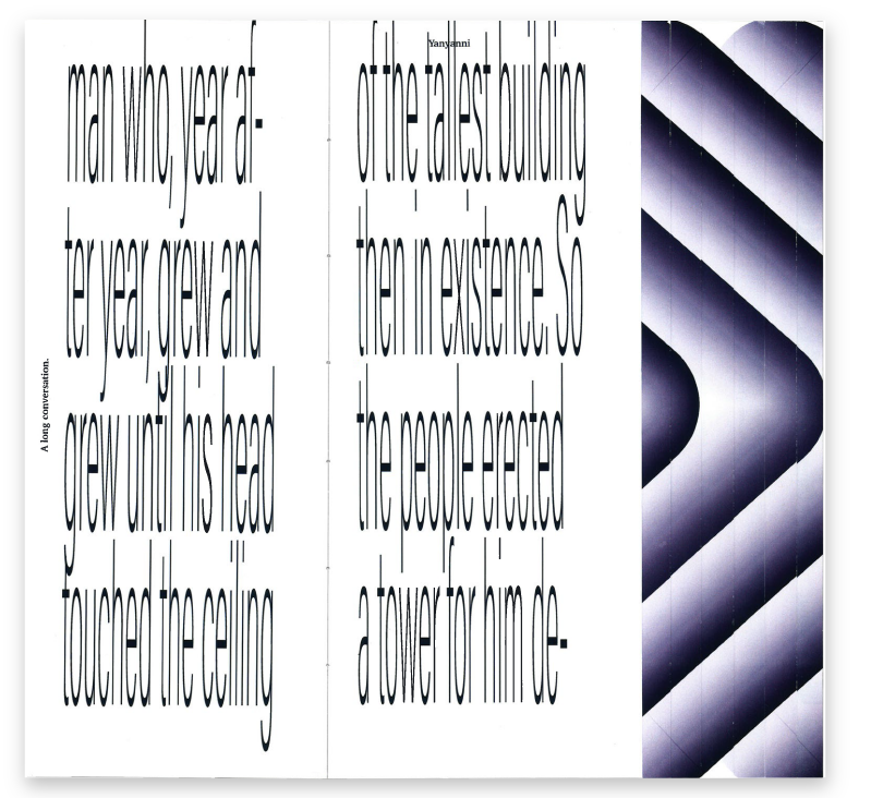
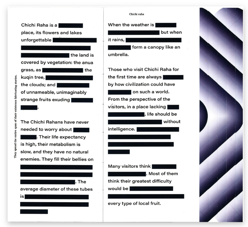
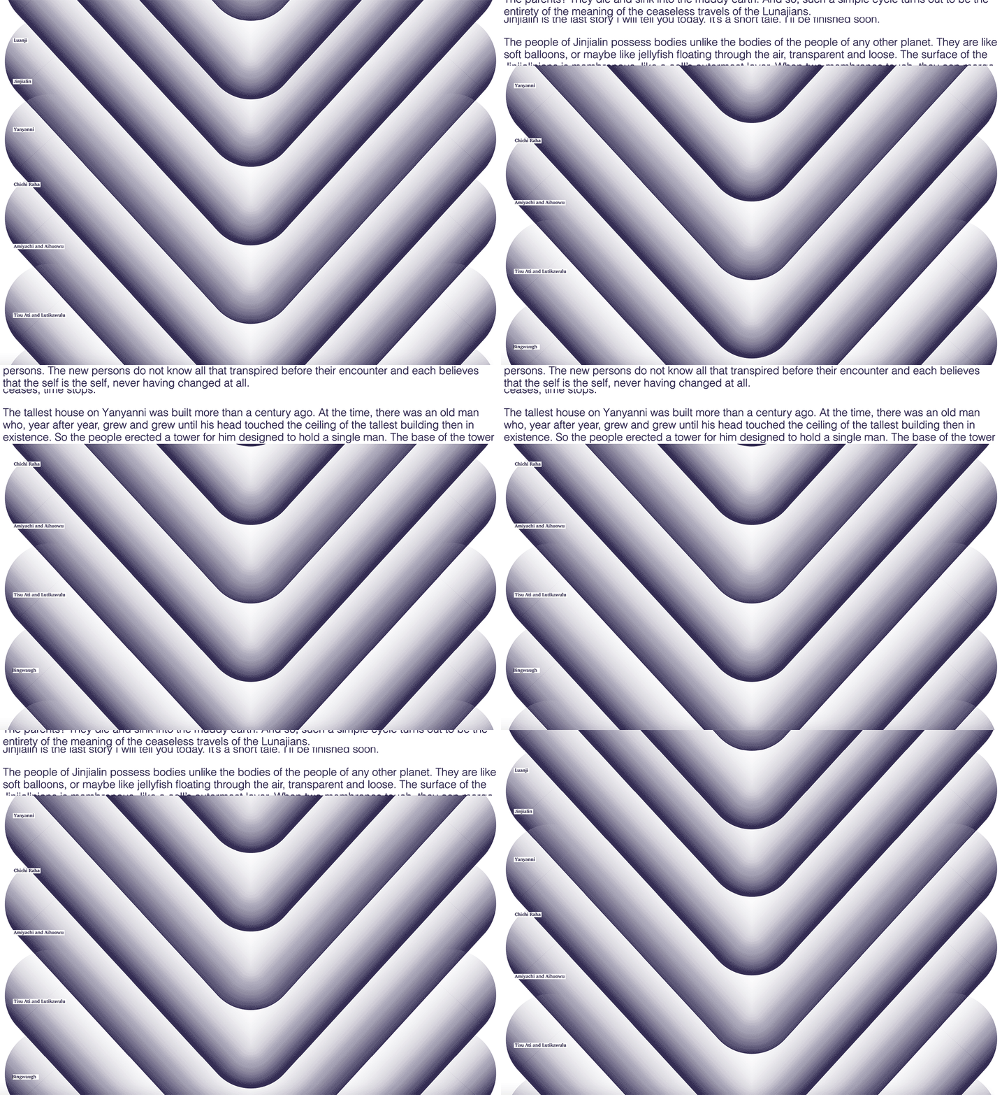
︎︎︎ This is the website, animated in a giff. For
the book I emphasised the looks, behaviour and developments of the inhabitants
of each planet. For the website I went the other way. The movement humans do
when using any website is scrolling and that is how the text of Hoa Jingfang will be revealed.